Responsive Web Design

What Is Responsive Web Design?
Responsive design is an approach to web design that makes your web content adapt to the different screen and window sizes of a variety of devices.
Why Responsive Design Matters?
When over half of your potential visitors are using a mobile device to browse the internet, you can’t just serve them a page designed for desktop. It would be hard to read and use, and lead to bad user experience.
The Building Blocks of Responsive Web Design
1- CSS and HTML
-
HTML mainly controls the structure, elements, and content of a webpage. For example, to add an image to a website, you have to use HTML code like this:
HTML <img src="image.gif" alt="image" class=”full-width-img”> -
Instead, CSS is used to edit the design and layout of the elements you include on a page with HTML. CSS code can be included in a < style> section of a HTML document, or as a separate stylesheet file.
Example :
img {
width: 100%;
}
Or we could target the specific class “full-width-img” by adding a period in front.
.full-width-img {
width: 100%;
}
2- Media Queries
- It works in a similar way to an “if clause” in some programming languages, basically checking if a screen’s viewport is wide enough or too wide before executing the appropriate code.
@media screen and (min-width: 780px) {
.full-width-img {
margin: auto;
width: 90%;
}
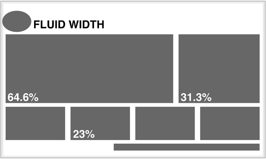
3- Fluid Layouts
- A fluid layout is an essential part of modern responsive design. In the good old days, you would set a static value for every HTML element, like 600 pixels.
A fluid layout relies instead on dynamic values like a percentage of the viewport width.
4- Flexbox Layout
- A flex container expands items to fill available free space or shrinks them to prevent overflow. These flex containers have a number of unique properties, like justify-content, that you can’t edit with a regular HTML element.
### Common Responsive Breakpoints
Common screen sizes
- Mobile: 360 x 640
- Mobile: 375 x 667
- Mobile: 360 x 720
- iPhone X: 375 x 812
- Pixel 2: 411 x 731
- Tablet: 768 x 1024
- Laptop: 1366 x 768
- High-res laptop or desktop: 1920 x 1080
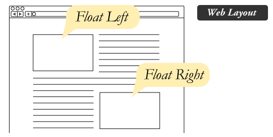
Float and Clear
-
The CSS float property specifies how an element should float.
-
The CSS clear property specifies what elements can float beside the cleared element and on which side.
How floats behave?
HTML is bound by some rules, in particular, the normal flow. In the normal flow, each block element (div, p, h1, etc.) stacks on top of each other vertically, from the top of the viewport down. But by using float the blocks will be sitting side by side.
Example :
 img {
	float: right;
}
- Clearing the Float
The clear property can have one of the following values:
- none - Allows floating elements on both sides. This is default
- left - No floating elements allowed on the left side
- right- No floating elements allowed on the right side
- both - No floating elements allowed on either the left or the right side
- inherit - The element inherits the clear value of its parent
_________
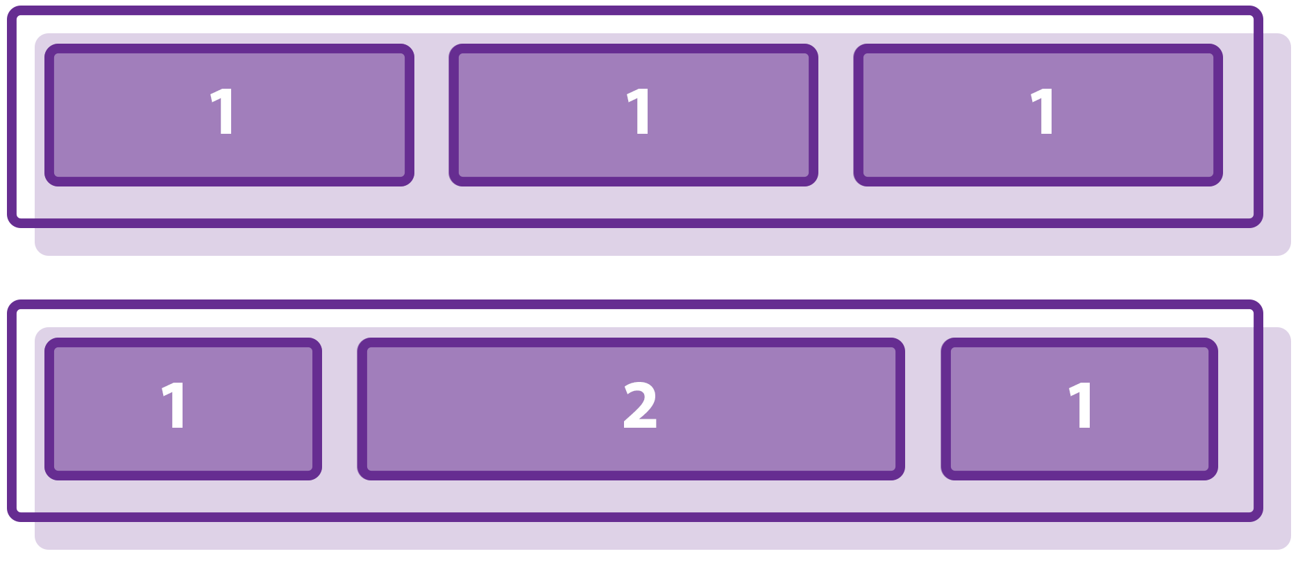
Grids
1) BASIC GRID – BY COLUMNS

The CSS may look complicated at first, but the raw essentials are:
Set the grid container #grid-col to display: grid. Then use grid-template-columns: auto auto auto to control the number of columns the grid has; In this case, we have 3 columns in this grid. Take note – auto will leave it to the browser to determine the width of the columns. We can also specify exact px or %. Finally, we add media query @media screen and (max-width: XYZpx) to add support for mobile devices – Simply change grid-template-columns so that there are fewer grid items per row on a small screen.
2) GRID ROWS

Just like the columns, use grid-template-rows to control the height. By default, the rows are already set to auto. So don’t bother to define grid-template-rows unless you want a specific height for a certain row.
Property| Description ———|——– display: grid |The container will display as a grid. grid-template-columns: auto px % |Set the width of the grid columns. grid-template-rows: auto px % |Set the width of the grid rows. grid-column-gap: px % |Spacing in-between the cells horizontally. grid-row-gap: px % |Spacing in-between the cells vertically. grid-gap: px %| Sets spacing in-between the cells horizontally and vertically. grid-column-start: |N and grid-column-end: N How many columns to span across. grid-row-start: |N and grid-row-end: N How many rows to span across. grid-template-areas: |’AREA AREA AREA’ Create a grid template with area names. grid-area: |AREA Assign this cell to this area in the template. __ Note :
“SMACSS : is more style guide than rigid framework. There is no library within here for you to download or install. There is no git repository for you to clone. SMACSS is a way to examine your design process and as a way to fit those rigid frameworks into a flexible thought process. It is an attempt to document a consistent approach to site development when using CSS